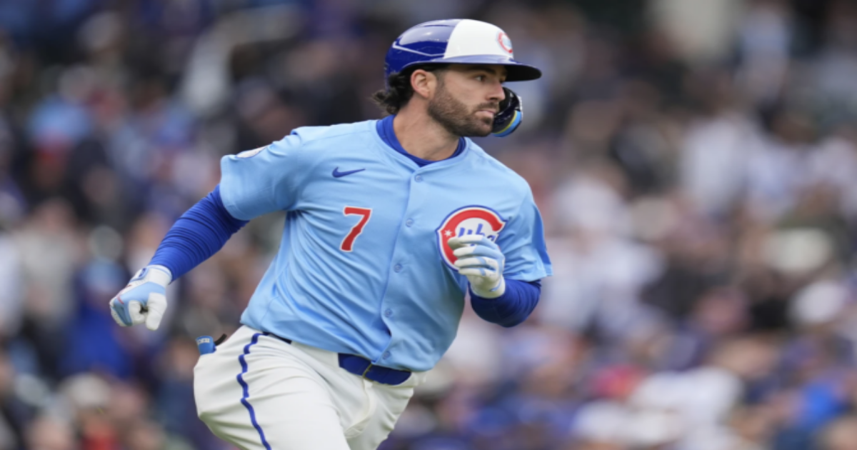
Yesterday, the Chicago Cubs’ new Blues Alternate Uniforms (do not call them City Connects) made their on-field debut at Wrigley against the San Diego Padres. The Cubs won, 7-1.
Yesterday marked the first time we saw the batting helmets to go along with the jerseys (see header image). To no one’s surprise, the helmets match the cap design.
As you can see, the caps and helmets have a shade of blue closer to what I would consider Cubs blue than the powder blue of the alternate jersey. I think it looks fine, but others may disagree.
One cool element about the helmets is that the Cubs used the jerseys’ number font for the helmets’ uni number decals, a nice touch. However, it doesn’t appear that the Cubs used an embroidered helmet logo, like on their primary batting helmets.
Phil did a great job covering these back when they were revealed. He had called them City Connects back then, because that’s what everyone assumed they were. It was only later that the Cubs had to clarify that these uniforms were not part of the City Connect program, despite replacing their Wrigleyville City Connects in their uniform rotation.
We are now in the era of City Connect 2.0 — the Nationals have launched their new City Connect, the Giants’ new CC was leaked over a week ago, and the past few days saw the (alleged) leak of the new CCs for the Red Sox, Marlins, White Sox, and Rockies.
Looking at all of the City Connect 2.0s next to each other, I can’t help but come to the conclusion that they all feel less inspired than their City Connect 1.0 counterparts.
The Cubs’ new blue alternate carries all the hallmarks of a City Connect uni, it replaced the team’s official City Connect uni, there are no rumors about the Cubs getting another City Connect uni, but it also feels more detailed and better-designed than the City Connect 2.0 unis.
Maybe I’m being conspiratorial, but perhaps this is why the Cubs didn’t want this blue alternate to be called a City Connect. Maybe they didn’t want it associated with these disappointments. Obviously, I don’t have any inside information from Nike or the Chicago Cubs to confirm or deny this, but I’ve been unable to shake this thought ever since I saw the most recent City Connect leaks.
It is an extremely difficult task to come up with new uniforms for 28 teams (the New York Yankees and West Sacramento Athletics passed on participating in City Connect, and it does not seem like they’ll participate in City Connect 2.0). It took Nike four years to get it done the first time. Now Nike is asking its designers to do it all over again.
Whether or not the Cubs’ new blue alternates were designed to be part of the City Connect program is ultimately beside the point. I think Nike is running into the issue we’ve all seen with NBA City Editions over the past few years. I’ve long complained that Nike was out of ideas for NBA City Editions — and it looks like they’re already out of ideas for MLB’s City Connects.
You guys tell me. Am I totally off base here? Let me know your thoughts — on City Connect 2.0, on my conspiracy theory, on the Cubs’ new alternate, on whatever — in the comments.
More pics of the Cubs’ new City Connect blue alternate are below.
